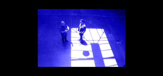
Design on a deadline: How Notion pulled itself back from the brink of failure

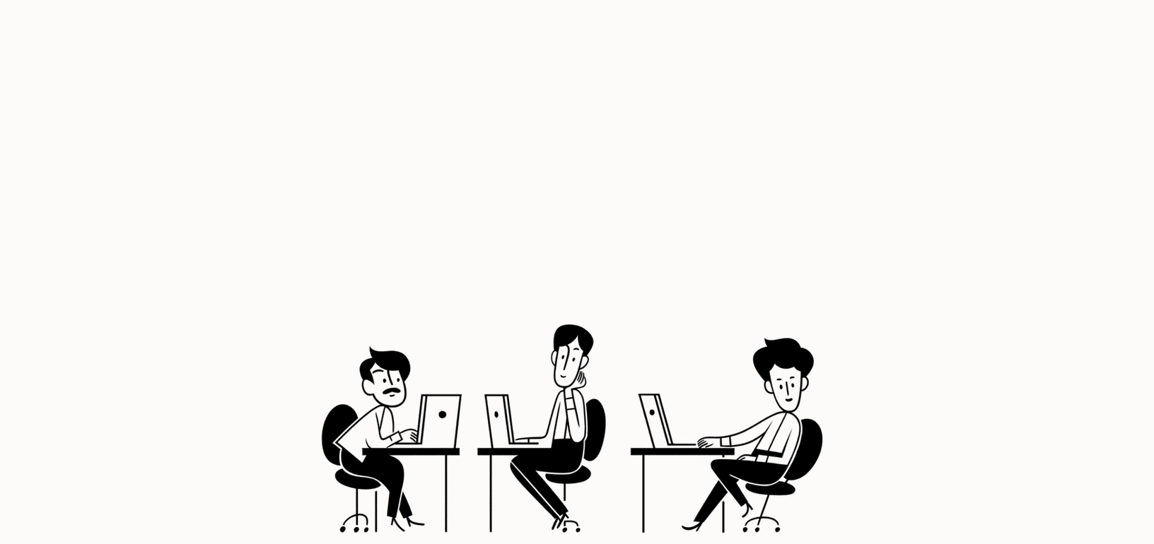
The story of its last-minute pivot and epic comeback.
In 2015, productivity tool Notion nearly died. Its founders, Ivan Zhao and Simon Last, had built their app on a suboptimal tech stack, and it crashed constantly. Their angel investment money dwindling, they faced a brutal choice: Fire their fledgling team of 4 and start over, or run out of cash. “If you looked at the burn rate, we all would’ve died together,” Ivan says. “It wasn’t much of a choice.”
So they sublet their San Francisco office and moved to a cheaper city where they could focus: Kyoto. “Neither of us spoke Japanese and nobody there spoke English, so all we did was code in our underwear all day,” Ivan says.
It was around that time we noticed Ivan in Figma. He suddenly popped to the top of our most active user list—spending upwards of 18+ hours a day in our design tool. As we’d later find out, he was designing frenetically and barely sleeping, pumping out version after version of a new app that would become Notion 1.0.
He and Simon set out to rebuild Notion from scratch, keeping the same mission: Give non-techies the ability to make their own tools without writing code. They wanted people to customize technology to solve their own problems.
Design means everything here. We’re a tool that solves people’s daily problems.
It was an ambitious goal, and they needed to nail the user experience. During their year of reckoning, they developed a unique design process to help them do that—from tag-teaming design challenges, to brainstorming endless permutations of a user flow. These tactics played a crucial role in turning the company around and became the secret sauce of their product when they relaunched. (Check out today’s news in The Verge about Notion taking on Evernote.)
We sat down with Ivan to get the full back story on the company’s pivot (which they've never talked about publicly before), and the role design played in saving the product.
Fighting for Notion’s life: Teamwork makes the dreamwork
There’s a lot of ways to build a customizable software tool. In the first go-round—Notion beta—Ivan and Simon made a programming application that was easy to use even if someone didn’t know how to code. It turned out, people weren’t interested in that.
“We focused too much on what we wanted to bring to the world,” Ivan put it. “We needed to pay attention to what the world wanted from us.”
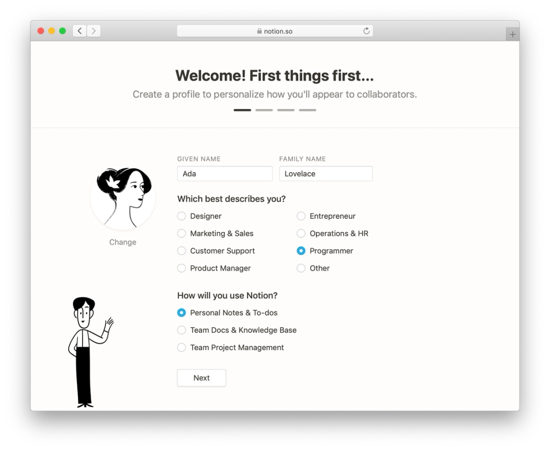
As you might imagine, pulling off this big of an about-face with their product required fresh design thinking. In their crunch year, Ivan and Simon worked collaboratively so they could move faster together. With Figma’s multiplayer feature, they’d jump into files at the same time and brainstorm. They’d riff off each other’s ideas or tag team different parts of the work.
“He’s programming, I’m designing. I could be programming, he’s designing. We were able to explore the maze together,” Ivan says. “The real-time thing with Figma is key—you can’t do that in many other products.”
In March of 2018, after months of sleepless nights, Notion 1.0 was ready for primetime. In short stead, it skyrocketed to the top of Product Hunt, got a glowing review in the print version of the Wall Street Journal, and became famous for something else—ignoring the door when VCs came knocking. Notion hit 1 million users with only a seed round of funding.
It also garnered accolades for its user experience, with some calling it, “a milestone in the history of UX design.” Despite the app’s powerful functionality, the new user home screen is minimal. It features a small collection of icons that harken back to Susan Kare (the mother of Mac iconography). Ivan calls it very “Windows 95.”
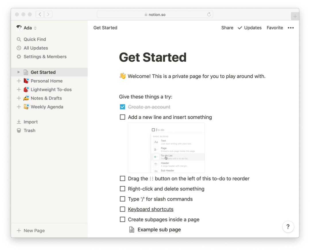
“Design means everything here,” Ivan says. “We’re a tool that solves people’s daily problems. Just like how they care about how the hammer feels or the knife cuts, how Notion feels has substantial value to them.”
Here are some of the tactics instrumental to Notion’s design process.
Create many variations, then choose one
In their year of crisis, Ivan would replicate a flow again and again, tweaking only small details here and there—swapping out an icon, adding a different line of text.
“Our general philosophy is to go crazy with permutations,” he says. “If the taste is there, which you can grow by studying typography and the giants of industry, you can churn out versions until you find the best one.”
To this day, Notion employs this method of endless iteration to make decisions. Designers create multiple versions of any deliverable, as do copywriters, engineers, and even the in-house illustrator. The key is to stay loose, hash out a bunch of rough drafts, embrace big ideas (even bad ones), and free as many concepts from one’s brain as possible. Then turn to your teammates and let them stress test. You’ll inevitably narrow the field to the best option. Ivan says this practice is the reason Notion’s brand is so distinct.
Give people tools that help them think, not just do
Notion prioritizes a culture of design by doing all their thinking visually. They develop ideas in Figma from the get-go, using it almost like a scratchpad. And that method applies to everyone at the tiny 13-person company, not just designers.
“With Figma, it’s easy enough for anyone to get a vision out of their head and onto the page for others to see,” says Ivan. “It’s truly a tool for thought, just like Notion. So we feel like kindred spirits in that way.”
If you visit Notion’s office (a skylit converted garage in the deep Mission), you’ll see people playing with designs in Figma to build arguments. They’ll lay out pages, drag and drop elements, and whip up mocks in response to product debates or community support tickets. They’ll append notes with Figma URLs and the line: “Would something like this do the trick?”
Build institutional knowledge as you go
Given Notion’s early history, Ivan and Simon have special appreciation for institutional memory—what has been tried before, what worked and what didn’t. As far as they’re concerned, nothing should ever be deleted.
“I am constantly like, ‘Do not replace that text! Just copy and create a new canvas!’” says Ivan. “In Figma, you open any file of ours and there’s seven or eight canvases all side by side. You see how the words and design evolved between one and the next.”
With that kind of record, people can learn from the mistakes of those who came before them. Notion’s Figma workspace is divided into a granular folder tree structure that makes it simple to navigate to any past project.
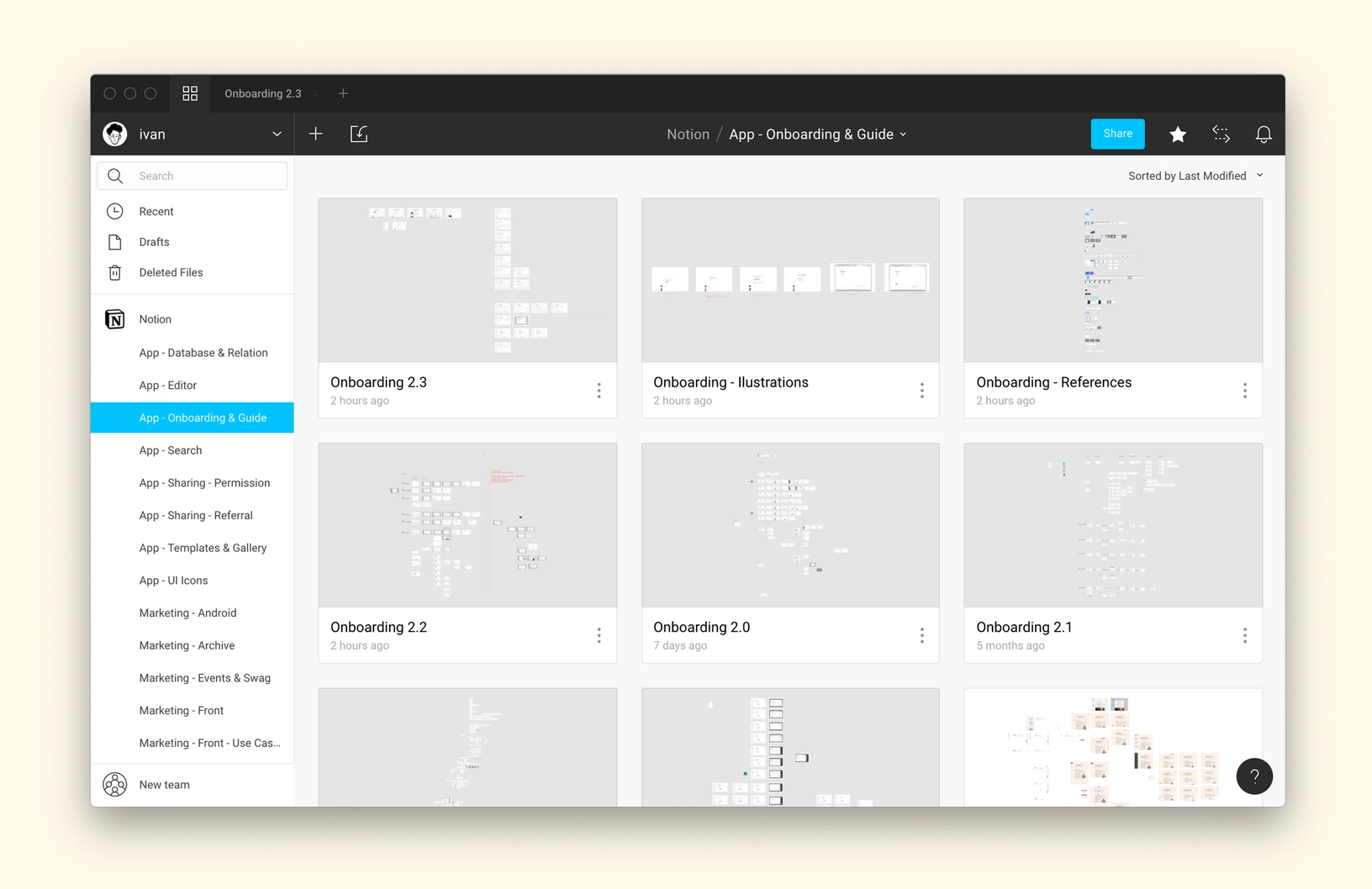
Fittingly, new Notion hires are expected to review the permutations Ivan and Simon explored during their 2015 rebuild of the tool. “They need to see how we came up with the way we think about things,” Ivan says. “And a lot of this lives in the designs we made.”
The falling dominoes
These are just a few of the reasons Notion’s rise continues uncontested, despite their small team and meager funding. With only a seed investment round in their pocket, Notion hasn’t felt the need to raise any more money. They hit 1 million users without it.
The tool is infiltrating tech companies from the ground-up, much like Slack and Dropbox did. At Figma, we first saw our customer service team quietly sneak off Google Docs and switch to Notion. HR came next, followed by Marketing. Like dominoes stacked to fall, once one team shared the gospel and showed what was possible, others couldn’t help but get curious.
Are you next?
